Prioritizing joy and discovery in a platform for Carnegie Mellon students to find HCI research opportunities that align with their interests, skills, and goals.
ROLE
Product Designer, User Researcher
TIMELINE
25 weeks
SKILLS
UX Design, UX Research, Interaction Design, Visual Design, Design Systems
TEAM
PM, Researchers, Engineers, Designers
Working with the Human-Computer Interaction Institute at Carnegie Mellon and in a cross-functional team, we analyzed the current system of how students find research, identified weak areas, and developed a product to connect students with research opportunities.
I was one of two product designers on this project and was the primary designer on the student-facing experience and had ownership over the design system, visual + interaction design, and prototyping. Additionally, I contributed to product strategy, discovery research, and user testing.
SUMMARY
Students are not applying to CMU research positions. Since 2021, there has been a 20% decline in applications.
HOW DID THIS PROJECT COME TO BE?
Without a dedicated platform, there isn’t a robust system to participate and engage with groundbreaking research. The institute aimed to create a platform that would enable students to discover research opportunities aligned with their academic goals, fostering innovation across the university.
Current Research Opportunities Spreadsheet
How might we simplify the process for students to discover and engage with research opportunities that align with their passion and goals?
RESEARCH
How did we go about conducting user research efficiently and effectively to gather insights?
Given the 1 month timeframe for the research and discovery phase set by our PM, the research team and I sought to grasp how current students are finding opportunities and their experience with the existing solution.
Research Methods
🕵🏽
Think-Aloud Study
15 users performed tasks and verbalized thoughts as they navigated interface
🔍
Difficulty in Prioritization
“I can’t find opportunities that cater specifically to me because it is so hard to filter information.”
📊
Heuristic Evaluation
Analyzed interface against Weinschenk and Barker’s principles to assess usability
Affinity Mapping + Organizing Insights
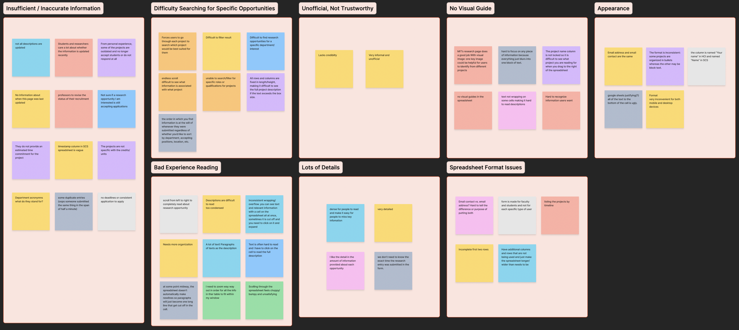
Major User Pain Points
🤔
Application Tracking Uncertainty
“I keep losing track of which opportunities I’ve contacted and which ones are still pending.”
🗣
Interviewed 20+ students to uncover motivations, goals, and pain points
User Interviews
👁
“Navigating the spreadsheet is a nightmare—everything blends together, and I can’t distinguish important details.”
Accessibility & Visual Challenges
Uncertainty about the accuracy and truthfulness of information in the spreadsheet caused skepticism and discomfort from students leading them to not apply.
KEY INSIGHT
With this key insight, I worked with the PM and researchers to synthesize and analyze our research insights and move towards a strategy and actionable goals.
DESIGN GOAL AND PRINCIPLES
Identifying core product principles to help guide the direction of the student experiences.
The goal we defined was to connect students and HCI research so that it becomes core element of CMU culture which would increase participation and innovation.
🤝
Trust
Ensure that the information on the platform is accurate and indicate that to students so they can rely on truthfulness of details.
🗺️
Intuitive Navigation + Filtering
The platform should be designed with seamless navigation that allows students to explore research opportunities effortlessly.
🪟
Prioritize a clear and logical structure to help students easily locate the most relevant information without feeling overwhelmed.
Clear Information Hierarchy
DESIGN ITERATIONS
Home Page
Identifying core product principles to help guide the direction of the student experiences.
The goal we defined was to connect students and HCI research so that it becomes core element of CMU culture which would increase participation and innovation.
Here I worked with the PM and researchers to uncover which filters students cared about and overall how best to design the home page so that it would be intuitive with clear information hierarchy.
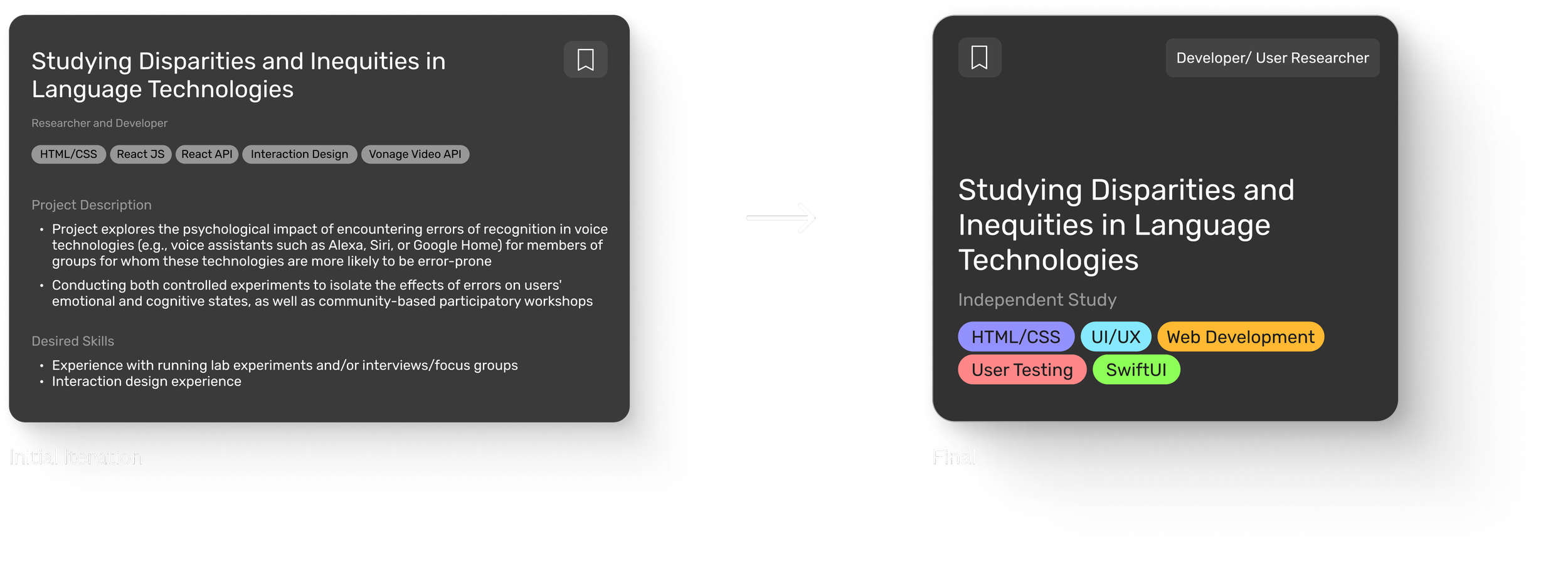
Designing the Project Cards
Project cards on the home page gives students basic information about the research topic which they can then click on to get more details.
Project Cards V1

Project Cards V2

Project Cards V3
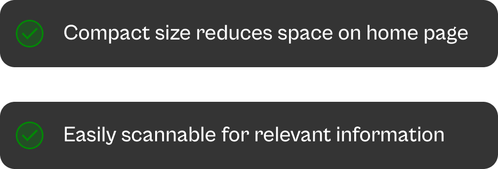
💡 Reducing clutter effectively
While breaking information into smaller pieces can simplify user interaction, it must be balanced with usability. The previous designs reduces cognitive load for the user, however it requires them to have poor readability and navigation experiences that in the end was not worth it.
Final Project Card Design

Project View Page
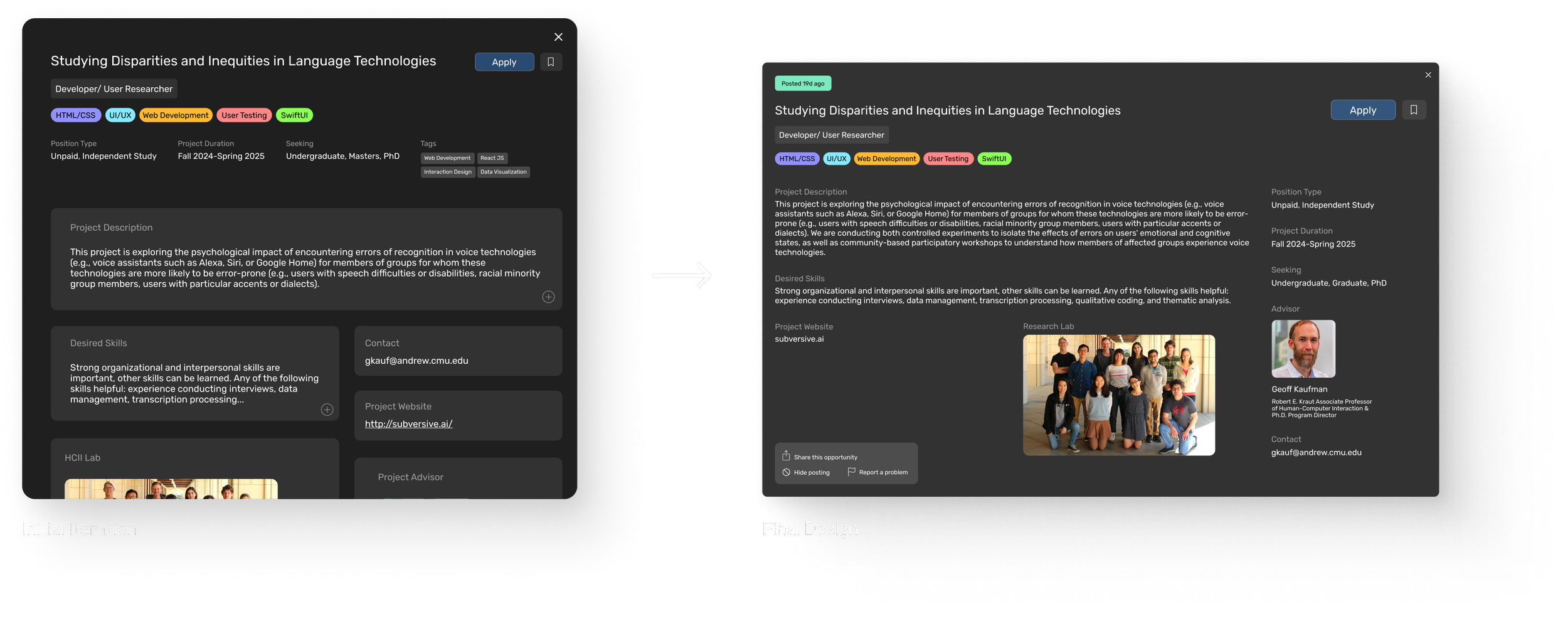
Viewing Research Opportunities in Detail
Students can view more information about research opportunities that they're interested in and qualifications for involvement.

Project Page V1
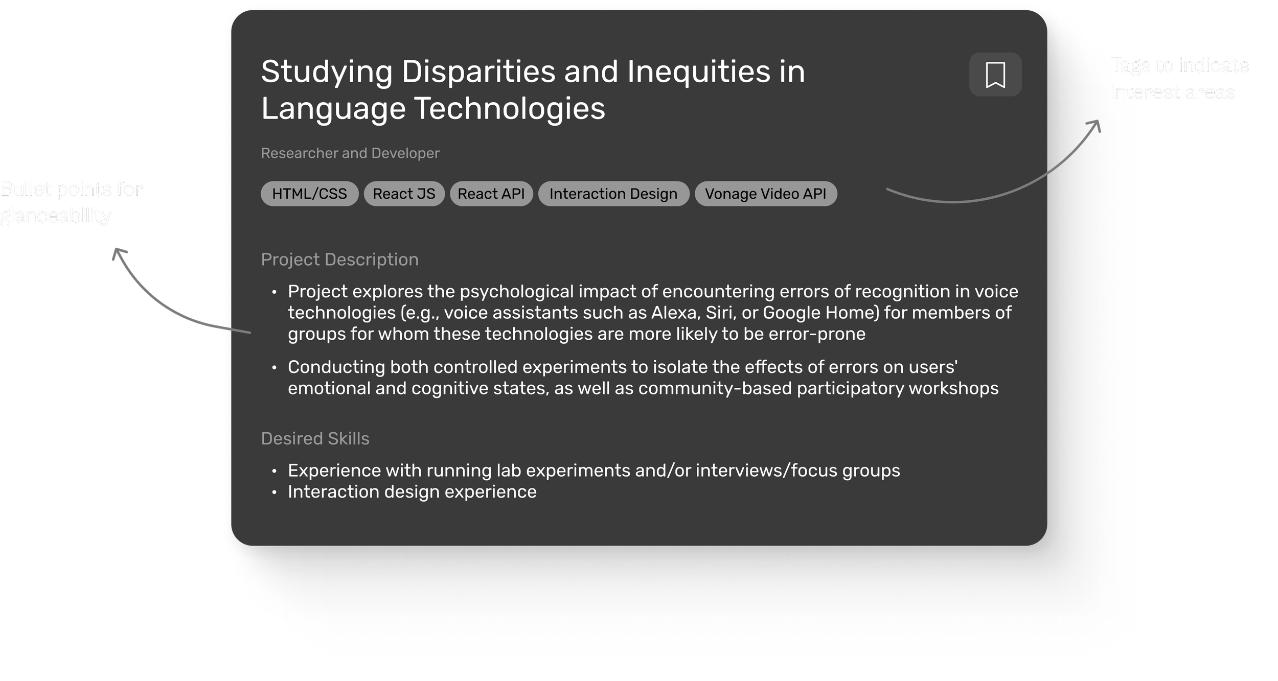
💡 Designing for glanceability
The goal here is to allow students to quickly scan and understand essential information, such as deadlines, desired skills, and timeframe without overwhelming them. Honing in on visual hierarchy and intuitive layout ensures that critical details are immediately visible, enhancing the user experience and aiding in efficient decision-making.
💡 Sharing early and frequently
Here, I learned that sharing designs with the team and gathering feedback early in the process is crucial for saving time and energy during cross-functional collaboration. It ensures alignment on goals, prevents miscommunication, and catches potential issues before they become bigger problems.
Project Page Final Design
Application Dashboard
For this feature, I worked with the PM to understand what the dashboard should have, whether it be data visualizations, some kind of analytics, or communication tools. We decided to keep it simple where students are able to see and keep up with their submitted applications.
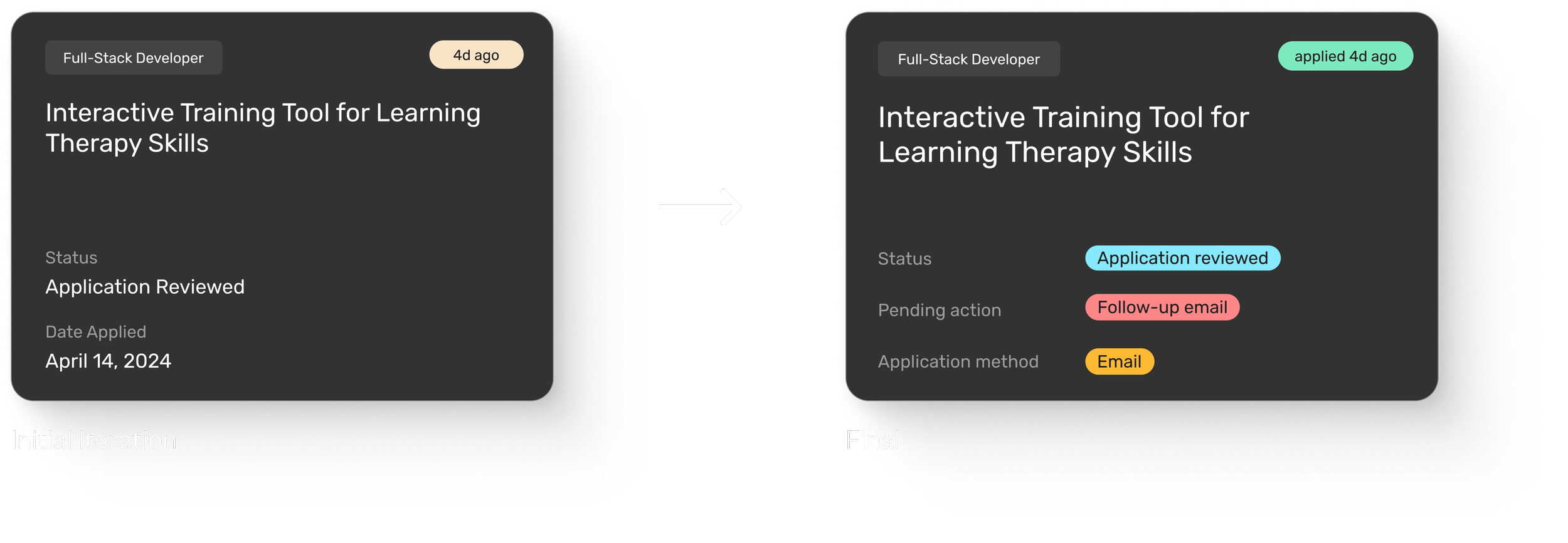
Designing Submitted Application Cards
The goal of this card would be for users to read and edit relevant information related to their application that they can glance at, and if they want, they can click on it to open up details related to the project, similar to the project card.


Submitted Application Card V1
No color, shape, or fill
Border
Designing delightful experiences through interaction design
Tag-Like Feel: Cards should resemble editable tags, giving users the intuitive sense that they can easily modify or customize details.
Consistency: Utilize interaction patterns and components that align with the existing design system to maintain a cohesive experience.
Accessibility: Ensure high contrast and accessible design to accommodate all users, including those with visual impairments.
Fill in
Hover background
💡 Designing seamless interactions
Interfaces should be visually impactful and have intuitive and natural interactions. Through exploring different patterns and components, I was able to hone in on how to quickly communicate editable tags to users, making the Hover Background our final design.
DESIGN SYSTEM
I was the sole designer building the entire design system.
I designed and considered everything from the typeface, to key components, patterns, and styles. Here I created UI kits with responsive and configurable components and designed a robust and flexible product. I also created detailed documentation with guidelines and best practices for consistency.
Design System: Components

Design System: Color + Type

Design System: Responsive Design

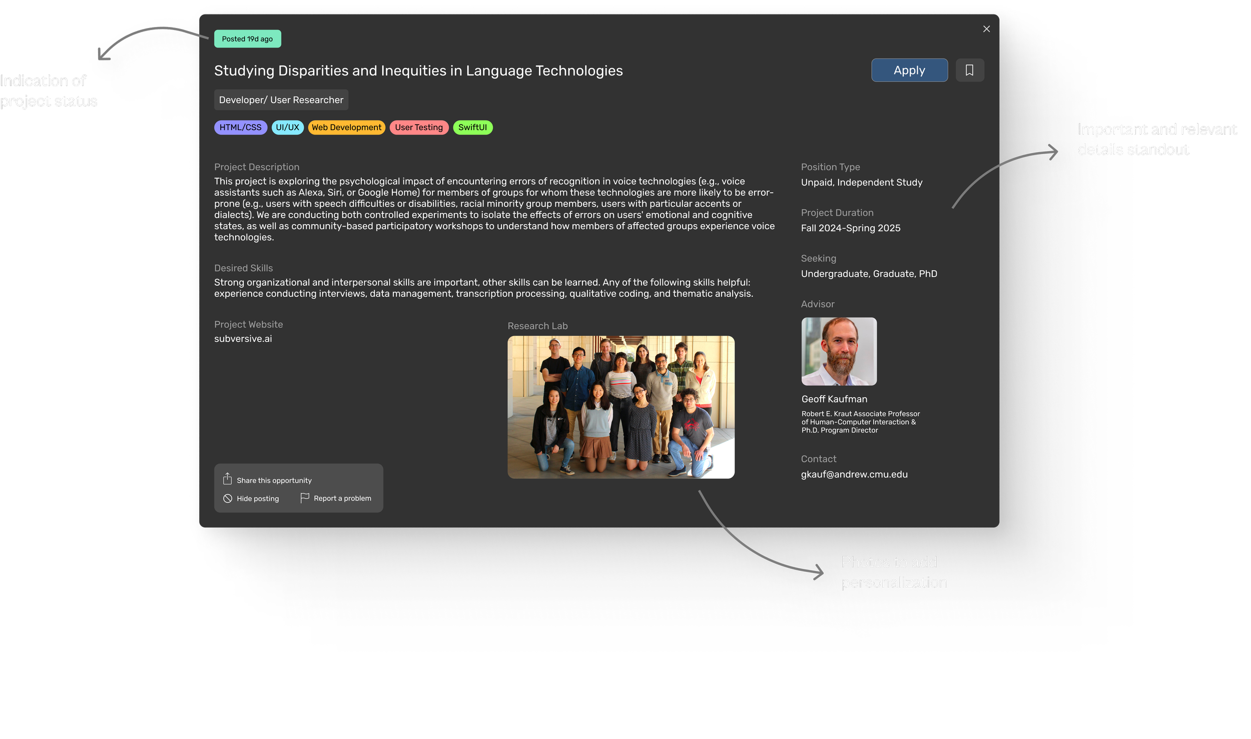
FINAL DESIGN
Explore and filter projects across diverse HCI research areas
HOME PAGE
Whether they're interested in developing emerging technologies or critical HCI studies, they can find that on this platform with ease.
Navigate simplified, concise information with ease.
PROJECT DETAILS PAGE
Understanding project goals, requirements, and details relating to how students can get involved is straightforward, allowing users to not spend too much time or frustration getting information relevant to them.
Stay organized and in control of research applications.
APPLICATION DASHBOARD
Students can quickly update statuses, document actions, and have a specific place for all their research applications.
After a specific length of time, short alerts pop up with tips on how to proceed.
ALERT ALERT
Messages like consider following up with an email, adds that small personal touch to enhance students’ experience even after they have applied to opportunities.
PROJECT TAKEAWAYS
⭐ I was the sole designer building the entire design system.
I designed and considered everything from the typeface, to key components, patterns, and styles. Here I created UI kits with responsive and configurable components and designed a robust and flexible product. I also created detailed documentation with guidelines and best practices for consistency.